When we develop applications, the user experience (UX) is a key component for us. Everyone of us has had experience with a bad UX and so we know how frustrating the best app becomes when you don't understand its UI. As we strive to be developers that are not stuck in a specific box like "frontend", "JavaScript" or "databases" we want to recognize a bad UX when we develop one.
Florian, our most experienced UX designer, took up the challenge and developed a UX course for our team. He started with a session where he showed us his understanding of a good UX and how to recognize a bad one. The team members that wanted to dive deeper into the UX design topic got together for a UI/UX workshop and thought about our vision of a great user experience and how to achieve it. The goal of our workshop was to share our knowledge and define a collective understanding of what we think is important for designing great apps. We also collected thoughts on what our non UI experts are missing for handling pitfalls and avoiding UX mistakes.
We kicked off the workshop by brainstorming what makes a UX a good UX. Every idea became a sticky note we then sorted into groups. We got a nice collection of quality characteristics as a result.
Then we showed some examples of projects with concrete UI / UX problems and asked ourselves two questions. „How did we know that we had this problem?“ and „How did we solve it?“ - We were sketching, looking at screenshots and talking about those specific cases and what we had learned from them. Those thoughts became sticky notes too, to be sorted into common problems and methods later.
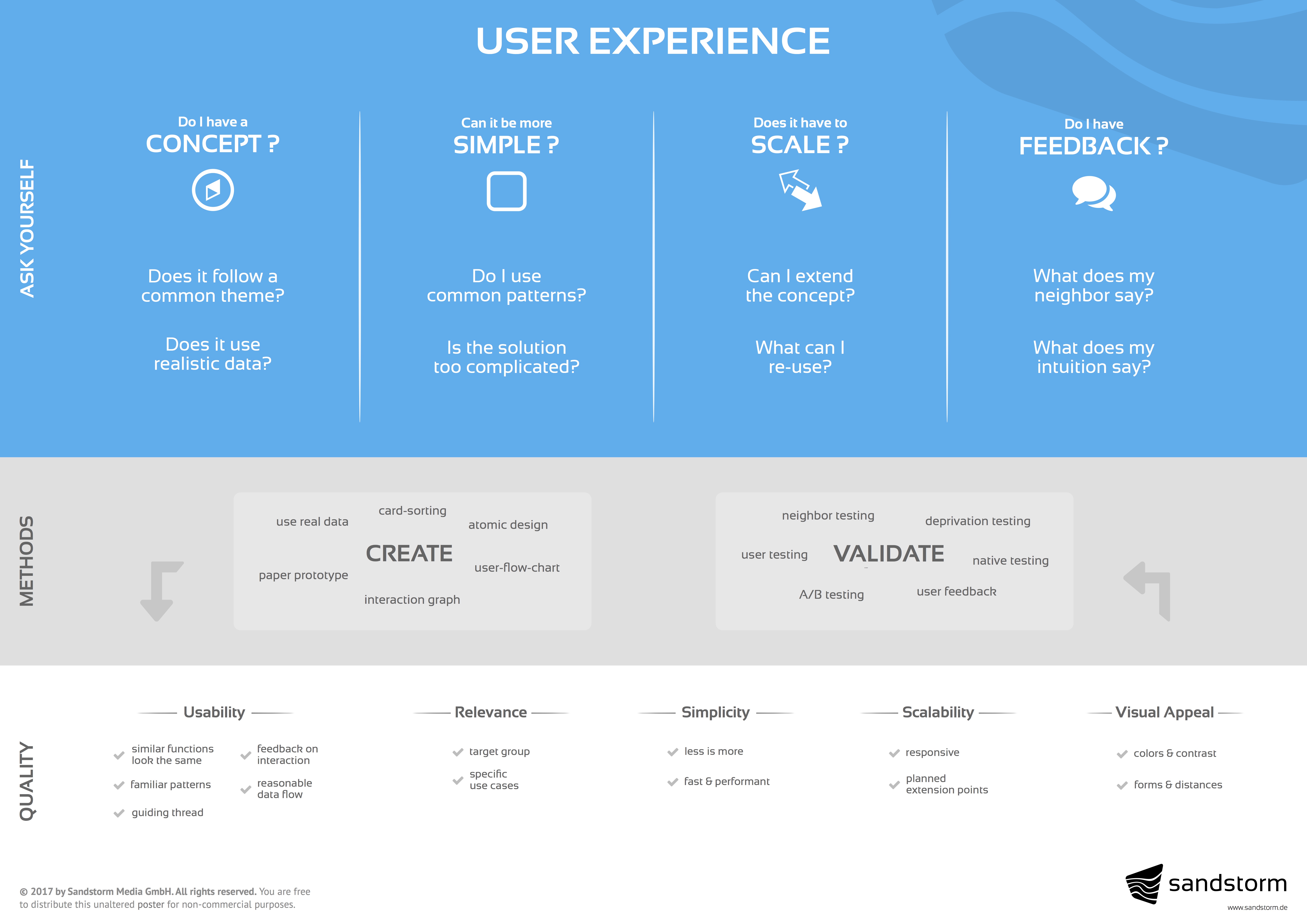
After we looked at the problems, we thought about questions that we would ask ourselves to recognize them in our applications. These questions were summed up into four key questions. They should be valid at any point of time in the design process: in the concept phase or when adding new functionality to an app. Everybody should be able to ask those questions, no matter if you are a developer, project manager or designer.
We gained a lot of of understanding at the workshop and transformed our results into a poster. This is it. We will hang it up in our office to be present and referenceable during everyday work so that we create an amazing user experience with every app we make.


